There is an important role for graphic designers to support social movements in
communicating complicated information in pleasing and efficient ways.*

Infographic from Water.org
Today organizers, advocates, and activists face a uniquely modern dilemma: information
overload. Confronted with the dire urgency of injustice, we so often find ourselves
struggling to communicate complex issues to people who are deluged every day with
massive amounts of data and information. Some social justice concerns are still
frighteningly simple; it does not take much to get across the horror of an event like
the shooting of Trevon Martin. But in many important arenas — such as economic
inequality or climate change — half the battle in educating one another is figuring out
how to simplify and communicate information in a way that is efficient, engaging, and
true.
Enter the information designer. We all know that the visual is important. Yet it is still
so common, walking by a rally, to be handed a double-sided sheet of paper packed with
text and maybe a grainy photo. When was the last time you read that front-to-back? The
world is a complicated place, but by uniting visual and word-based information in
creative ways we can better reach one of the key goals of social movements:
understanding.

Lifecylce of the Japanes Beetle
Designers of Information
People have been displaying information visually for, well, ever. Over the centuries,
cartographers, artists, educators, scientists, journalists, and many others have developed engaging ways of communicating information through
images. But the modern field of “information design” is uniquely embedded in
today’s world of statistics, vast information availability, and the internet. A new
breed of visuals has sprouted up under the name infographics, and some of the
results are astoundingly beautiful. Increasingly popular in newspapers, magazines, and
on the web, infographics come in many shapes and sizes, describing all kinds of data,
processes, and relationships. (For example, see the recent
infographic on racism in technology published on this site).
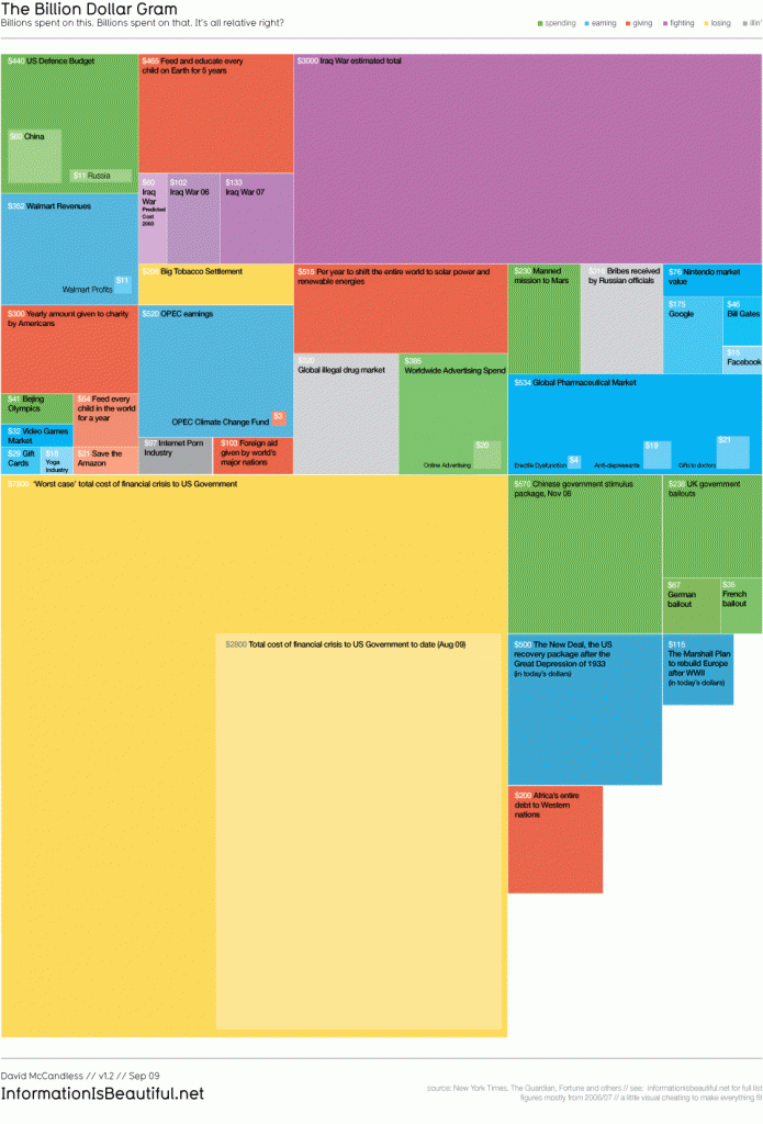
One of the modern masters of this art is David McCandless, whose recent book The
Visual Miscellaneum has me enraptured. A “data journalist,” McCandless has been
creating visual representations of all kinds of information, from global militarization
to creation myths. His work shows stunningly how design can give context to huge
numbers, uncover new relationships, and engage the viewer in ways that the raw
information could never do.

David McCandless: Charting our (irrational) fears in the
Media
Across the web one can find
many examples of infographics that tackle social-justice issues. But one of the
more exciting efforts has been Occupy Design, an online effort to create a “visual
langauge for the 99%” in concert with the Occupy movement. Though their focus seems now
largely on more propaganda-style art, they originally also created a number of
infographics to communicate the economic realities underlying the Occupy movement. They
offer an example of how we might begin to build explicit relationships between graphic
designers and movements.

Infographic by Occupy Design
Information Design in Practice
As I see it, information design could play out in a couple of ways in social justice
work. First of all, as modeled by Occupy Design, professional designers could be called
upon to bring their skills to social movements. Their role would be to developing
graphics that flesh out the systems of power and oppression that movements are
addressing — or alternatively the history of efforts towards change.
But a second strategy could be a pedagogical one, which I believe would have a much
broader effect. The act of creating information graphics is itself a process of
learning. Rather than simply hiring a graphic designer to better convey information,
designer/educators could facilitate the analysis of information and the creation of
information graphics by members of the broader movement. This would serve as both an
internal pedagogical process, in which a community of people teach one another and build
research and design skills, as well as a tool for external communication.
Either way, the tools to communicate and educate are there, we just have to take them.

David McCandless’s Billion-Dollar-Gram
*This argument has nothing to do with the fact that your humble blogger here is a graphic
designer. Probably.


