
Earlier this year, I did some graphics work for the Family Leadership Design Collaborative (FLDC), a group whose mission is to radically re-imagine family engagement in schools and other institutions. It turned out to be one of the toughest design challenges I’ve faced.
In this post, I want to share a bit of that design process with you. The back-and-forth that the process inspired — with me offering draft images and them giving critiques — was fascinating on its own. But more than that, this project exemplified some of the tensions I’ve struggled with over the years creating visual communications for social justice groups.
One of these recurring tensions has to do with the use of symbols. Infographics and other visualizations often rely on simple, widely-recognizable symbols to communicate ideas. We know instantly that a paintbrush means art, a graduation cap means education, and two tall figures and two short figures means family. These symbols serve as visual shorthands, allowing images to be comprehended quickly, and by a broad audience.
A social justice perspective, however, values diversity and inclusiveness. There is no one kind of family, no one educational path, and to simplify these ideas into universal symbols is to marginalize those who deviate from that single image. In addition, social justice is often about imagining how the world could be. That can be hard to do using symbols that are based on the world as it is — particularly if you’re not totally sure what the future you are fighting for will look like. But the farther you stray from the dominant culture’s symbols, the less you can assume that viewers will immediately recognize your meaning.
These are not insolvable dilemmas. Many artists are navigating them creatively. Here’s a story of one of my attempts. I hope it offers some useful insights; I certainly learned a lot. And since I recently critiqued another person’s visualization, it’s only fair that I share some of the critiques I’ve received — all of which, ultimately, have led to better designs.
The Job
Ann Ishimaru, a professor at the University of Washington, approached me with the job. She and her colleague Megan Bang had received funding from the Kellogg Foundation to bring together a group of nationally-recognized community organizers, educators, and researchers from around the country for a two-day meeting. The topic under discussion was family engagement — the practice of supporting families as leaders, advocates, and collaborators in schools and communities.
Ann, Megan, and their colleagues were not content with the current state of “best practices” in family engagement. Their goal was to to develop “next practices” — approaches that go beyond what we’re doing now to what is possible tomorrow. They wanted to center racial justice and the voices of “nondominant” groups, with the ultimate goal of “family and community wellbeing and educational justice.” Ann wanted to capture all this in an image to share at the meeting.
Clearly no small task.
We began with a couple different concepts. One was Tupac Shakur’s metaphor of “the rose that grew from concrete,” which is about the strength and beauty of people who learn to thrive despite facing significant life challenges. Ann wanted to expand the metaphor to explore what was happening below the surface of the concrete, as well as the broader ecology around the rose.
Another concept was root systems. The root systems of plants are often much more extensive than you’d expect, just as there is much going on beneath the surface in marginalized communities that goes unrecognized by outsiders. As a starting point, Ann shared with me the image below, showing a fungus that that attaches to plant roots. She liked the way the tendrils were interconnected through nodes, which suggested ideas about human interconnectedness and networks.

After some back and forth, I drafted the image below. I carefully selected flowers from different climates around the country to communicate the diversity of the gathered group. I also used flowers at different stages of growth, to symbolize inter-generational collaboration. The urban landscape signified the broader ecology within which family engagement took place, as well as the large, often inaccessible institutions that families had to navigate. Linked root systems signified networks of mutual support, and a rootedness in shared history and culture.

The image sparked some great discussion at the meeting. Basically, they didn’t like it. Perhaps the loudest critique was about the lack of people in the image. Family engagement and leadership, they said, is about human beings, and that needs to be clear. Another critique was that the use of flowers made it seem like the image was about the environment. A third critique was that family leadership isn’t just about breaking through racism and oppression (the concrete), but also about building something new. Ann summarized it this way:
“The roots of schools as we know them are stunted and problematic from the get-go. They are rooted in oppression, in colonization, in assimilation and the stealing of land. How do we reconstruct something entirely different — not a school building, per se, but a system of education that starts from the roots and strengths and cultural practices of different communities and then builds from there…the process of growing or cultivating that somehow helps communities to heal, to be well, to build solidarities, to envision themselves into the future.”
 In conversation with Ann
and Jondou
Chen, the project director, I began to sketch out a new image that
showed people with roots in the ground. The people had tools in
their hands, to symbolize the building of new types of institutions. But Ann
and I agreed that it was getting a bit too “we are the
world,” and losing any indication of oppression and struggle.
In conversation with Ann
and Jondou
Chen, the project director, I began to sketch out a new image that
showed people with roots in the ground. The people had tools in
their hands, to symbolize the building of new types of institutions. But Ann
and I agreed that it was getting a bit too “we are the
world,” and losing any indication of oppression and struggle.
At this point I realized I needed to shift my design approach. Simple stick figures could never capture the full humanity of people, or the complexity of family leadership across all the different groups involved. What if I used actual photographs? This idea led to the image below, based on Ann’s description of “a system of education that starts from the roots and strengths and cultural practices of different communities.” What would such an education system look like? (I used photos from an older project on community organizing for these early drafts, so thank you to all the groups featured!).

Ann and Jondou liked the photos. However, they said the root system looked like a honeycomb. Also, they really didn’t like the top part. It was immediately clear, when they looked at the image, that the idea of a new institution as the end-goal wasn’t right. (I wasn’t thrilled with it myself, since it ended up looking like a cathedral, which is culturally specific and has its own baggage). Having an idea rejected like this can be frustrating, but over the years I’ve realized that this is one of the more helpful services visualizations can offer. By having their words reflected back to them as an image, they were able to clarify what they did not mean, and the dialogue moved forward in a better direction.
After some more conversation, I merged the ideas from my last two designs and came up with the graphic below. I moved the images of family leadership work into the leaves, rather than the roots. This suggested that people in communities around the country were already carrying out “next” practices, that the future goal was already here within today’s struggle. The multi-colored soils were meant to represent the diverse cultural and historical roots that fed this work. (At one point I tried to put historical images of family leadership and activism among the roots, but it got WAY too busy.)

Ann, Jondou, and their colleagues really liked the new direction, but had a few concerns:
- The image came across as too individualistic. Each person was on their own, rather than connected to larger families or communities. As an alternative, they suggested multiple figures in groups, with arms/branches connected.
- The landscape, at least to some, read as literally urban (rather than as a metaphor for unwelcoming institutions). They worried this was not inclusive of groups working in rural areas.
- They wanted more age diversity among the figures, because so much of the work was intergenerational.
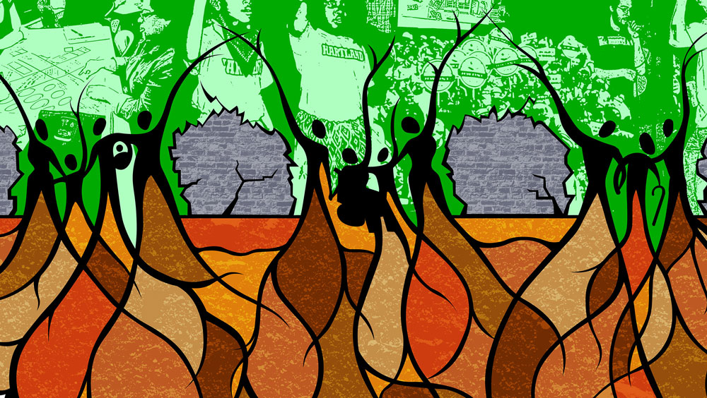
After a few more rounds of back-and-forth, we landed on the image below. In the end a wall, rather than a city, was used to symbolize the barriers faced by families. I drew inclusive, diverse groups of connected people, which purposefully did not read as traditional nuclear families. To be sure, it not the kind of graphic whose meaning is immediately clear to a viewer. Rather, it invites exploration, explanation, and discussion. It is as much about the feeling of the work as about the idea of the work.
Though it took a long time, and many re-drawings, ultimately the critiques greatly improved the design. In addition, the design process helped Ann and her colleagues clarify their own mission, goals, and values. Now the FLDC is running collaborative research projects in communities around the country, and I’ve been told that one group used the image to guide their discussions. They asked participants to describe how race and class have shaped their own histories (the roots); to write their hopes and dreams for their children, schools, and communities on cut-out leaves; and to use white note cards as “walls” to represent the barriers and challenges to realizing those hopes and dreams.
All around, a success, though I wouldn’t be surprised if we continued to adapt it going forward.


Oh my gosh I am so very intrigued with what you do. I have the mind to do this kind of work but I do not have the education to get a job in the field but it is so intriguing, so very interesting and the challenges are so stimulating. The back and forth is what I love. For people to understand that this is what you WANT to do in your job is sometimes hard to translate. They seem to think you are feeling like you have done wrong. They dont realize the fascination in the challenge for the creators. The satisfaction and celebration that comes with you finally getting it so perfect for what they want is incredibly rewarding. Finding a group who completely understands this is the process and you being able to properly work through the process with them…. priceless. Good for you and thanks for sharing